My blog

All opinions are my own; your mileage may vary!
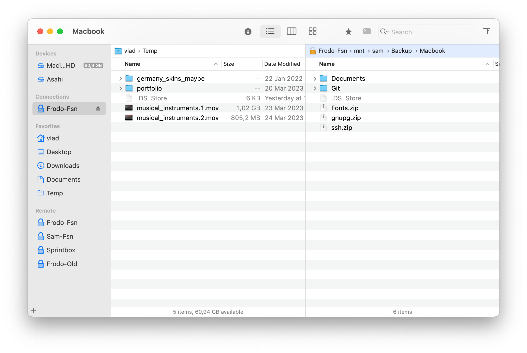
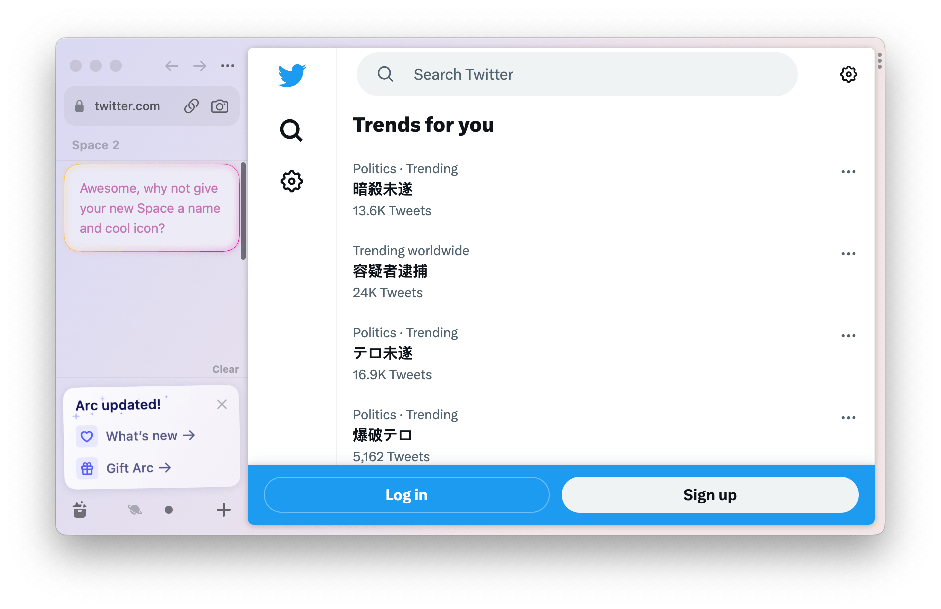
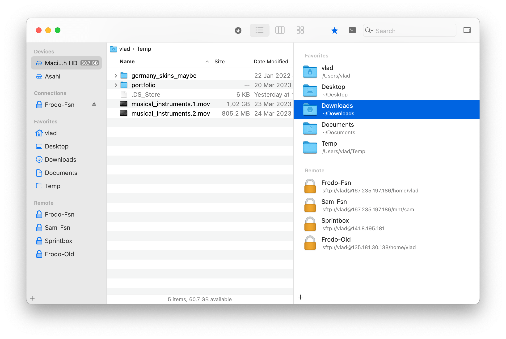
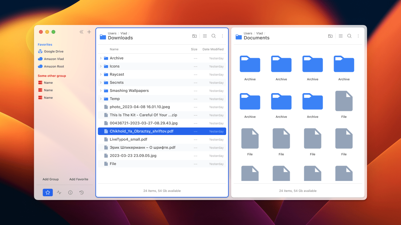
My FL3 setup:
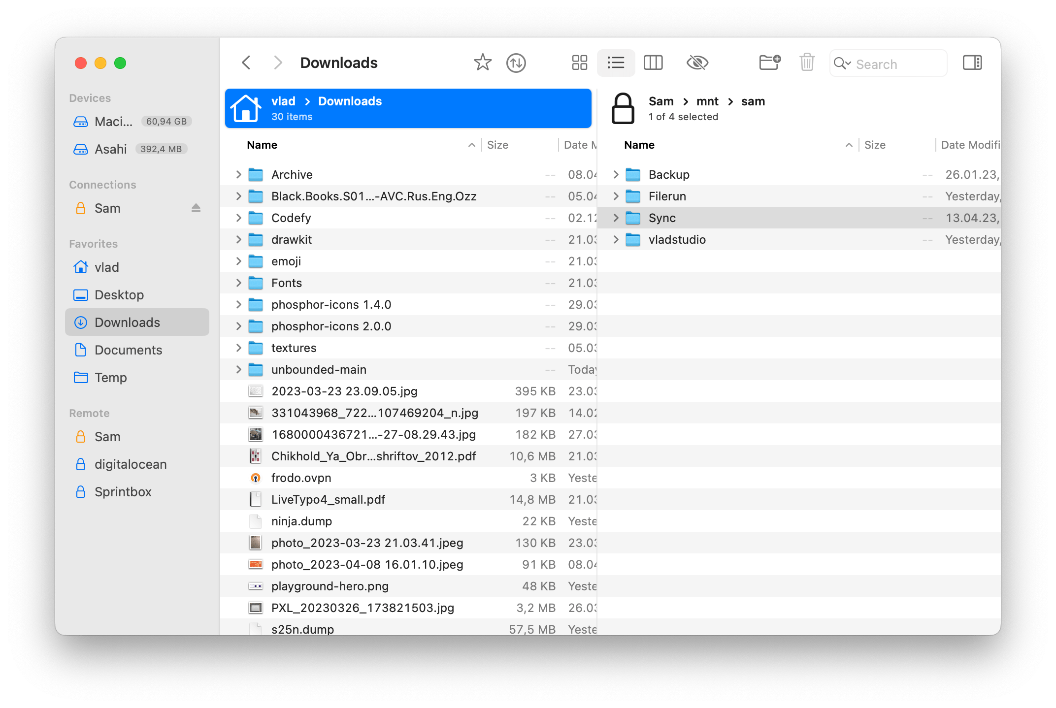
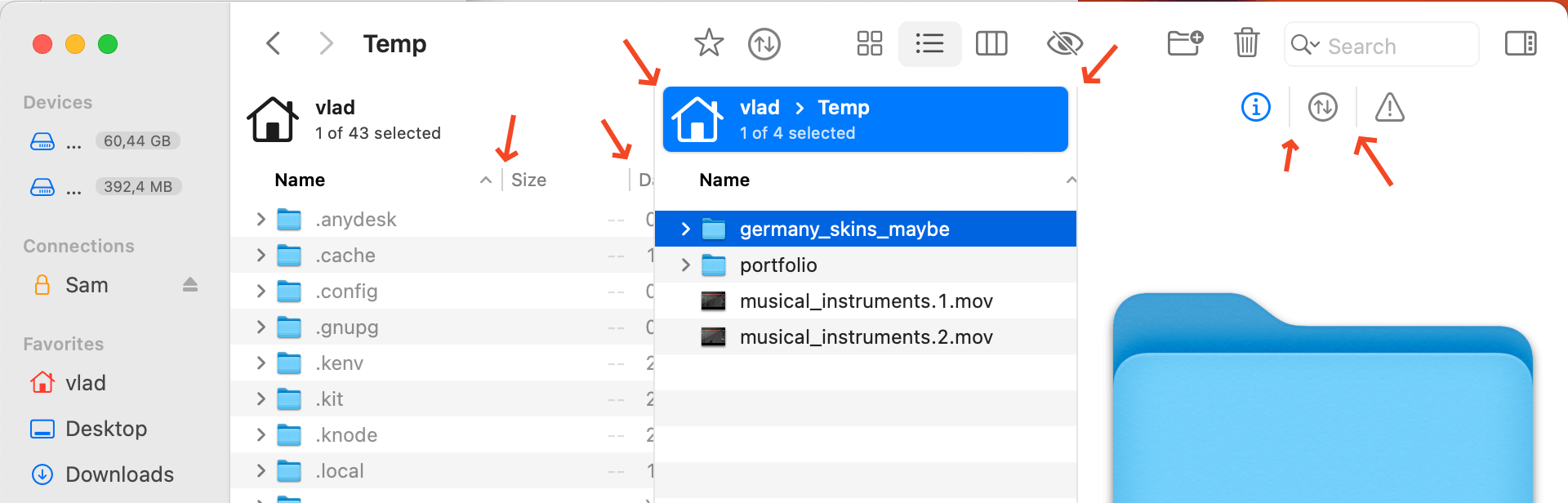
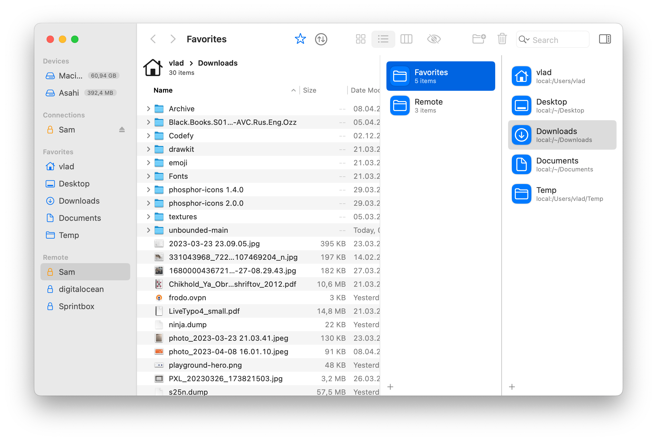
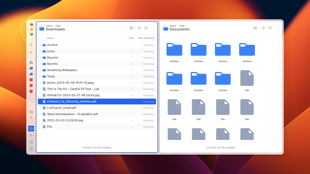
My FL4 setup:
I’ll try to explain below why I think FL3 has better UI.
Unique look vs OS-like look
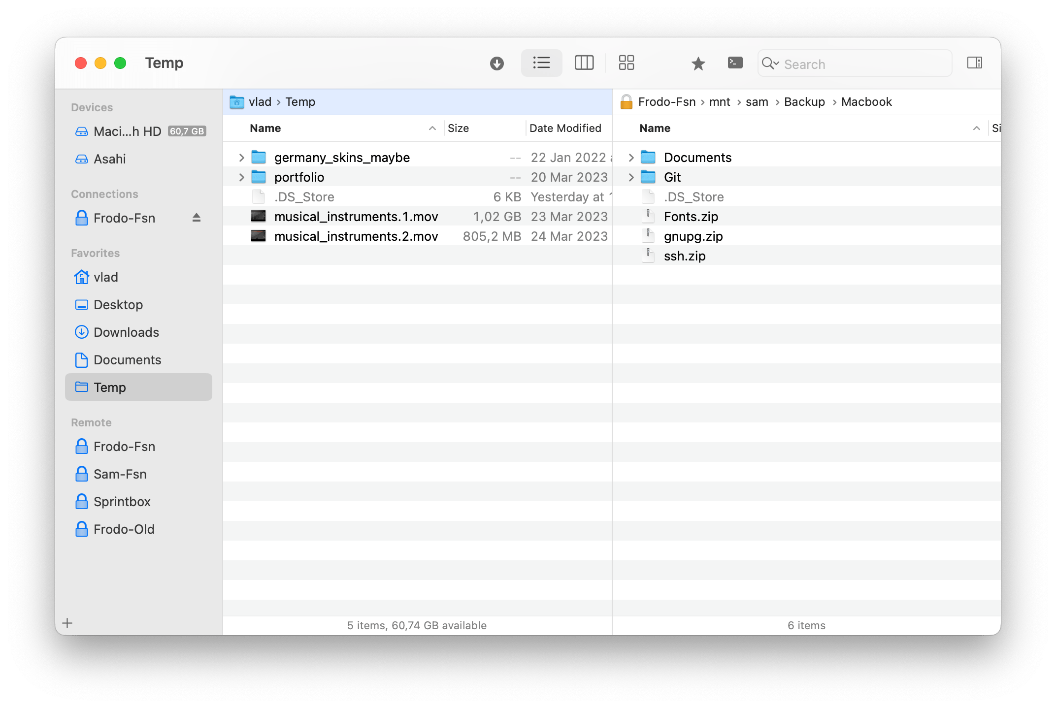
All Mac apps can be roughly divided into 2 groups:
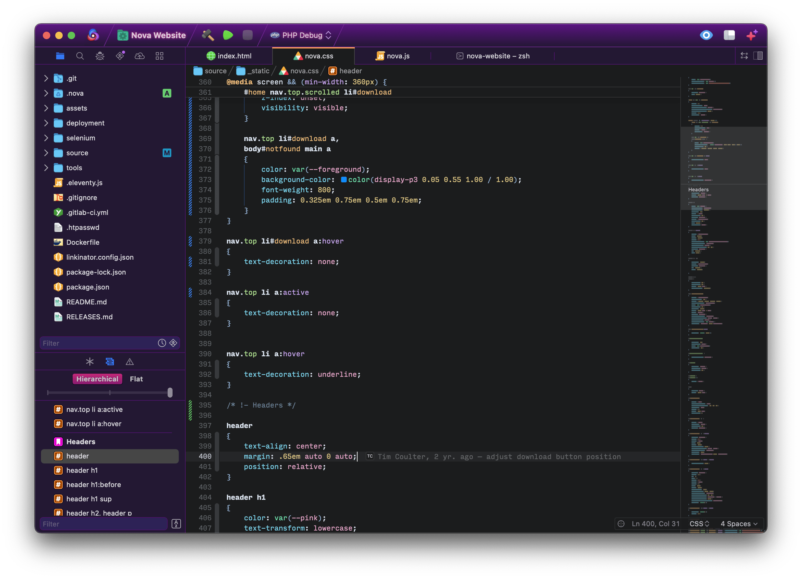
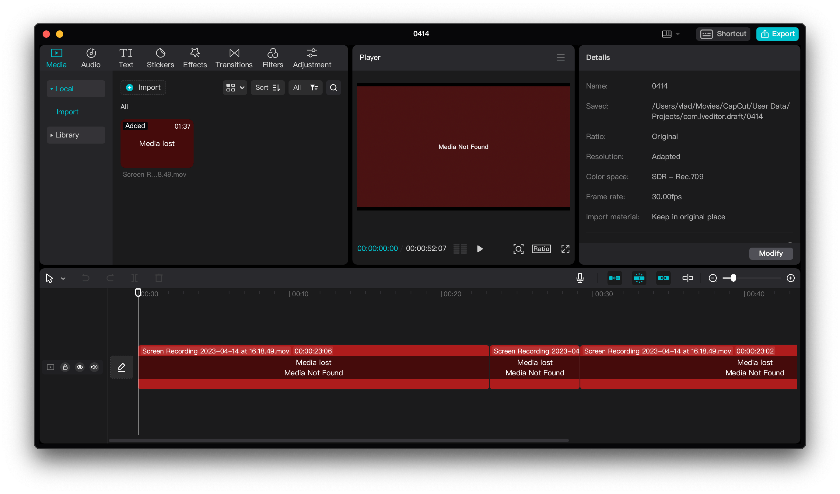
- Apps with unique look. They keep MacOS in mind, but all (or most) components are designed uniquely for the app. Examples: Panic Nova, CapCut, or Arc browser.
- Apps with OS-like look, such as FL3. All (or most) components are (or look like) native to OS (HIG):
Both ways can be great for an app. Being stuck in between these two ways can be problematic.
I considered FL3 to be OS-like app (in the sense of UI design). FL4 has some issues with that – drifting away from “OS-like”, but not quite arriving into “unique” category. See below for details.
Borders
In a lot of aspects, the redesign of FL4 seems to be aimed to be more modern. In particular, I noticed you removed a lot of borders, compare FL3:
to FL4:
In theory, this makes UI more modern. However, many removed borders served a purpose. Without them, you get the inconsistent, unpolished feeling. The biggest contributors are borders ending nowhere:
I browsed through various Mac apps, and almost always, the top bar is separated by a border. One exception is Mail app (1), but the border appears when you start scrolling (2):
Icons
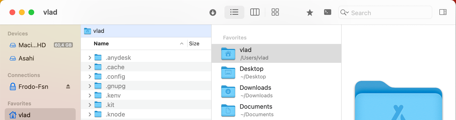
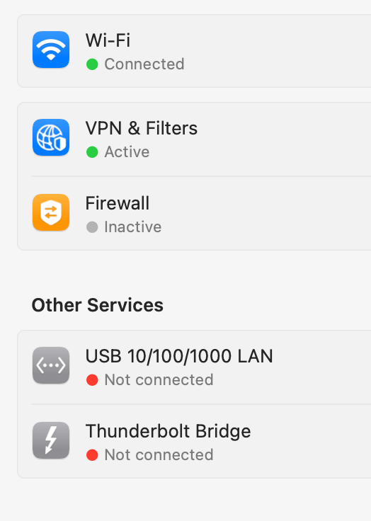
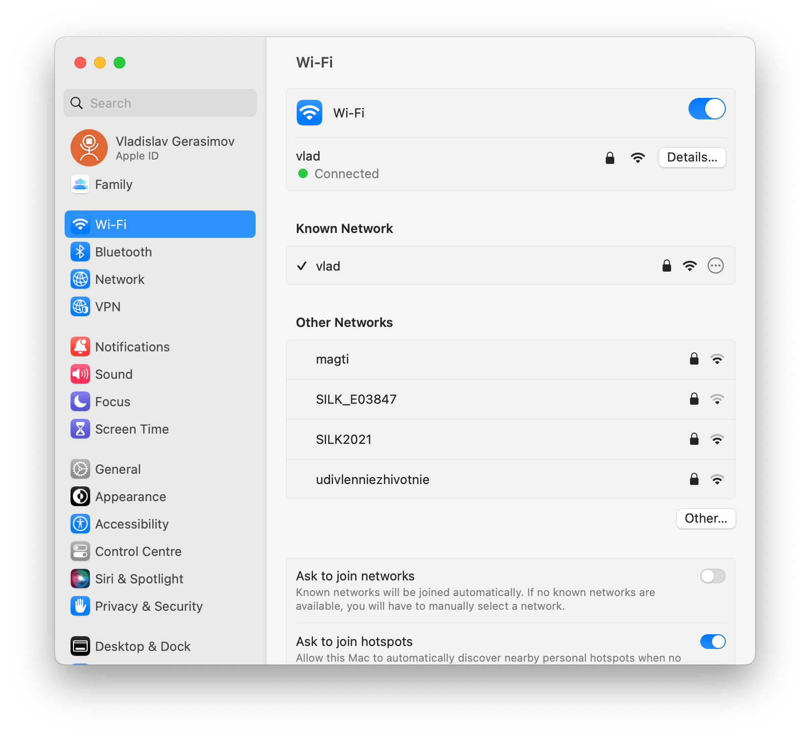
Perhaps it was your intention to make icons more modern, to better fit latest iOS and/or MacOS. While the general direction is great, there is still room for improvement. Compare this (random) screenshot from MacOS settings with FL4 favorites:
MacOS settings:
- smaller icons
- different fill colors
- subtle gradients
FL4:
- icons too big
- same monotonous blue
- flat blue color
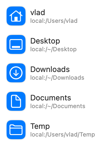
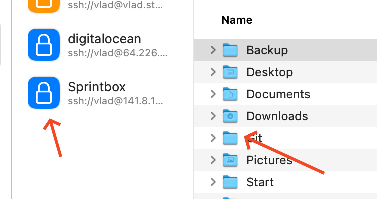
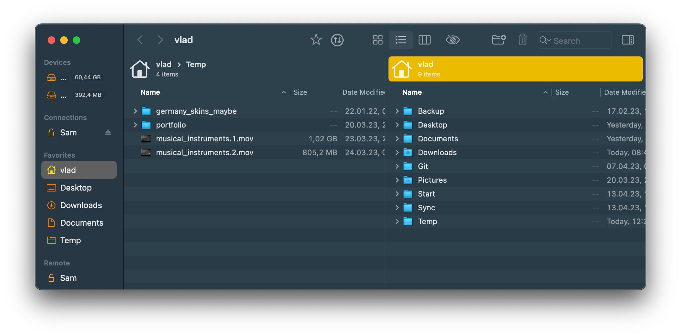
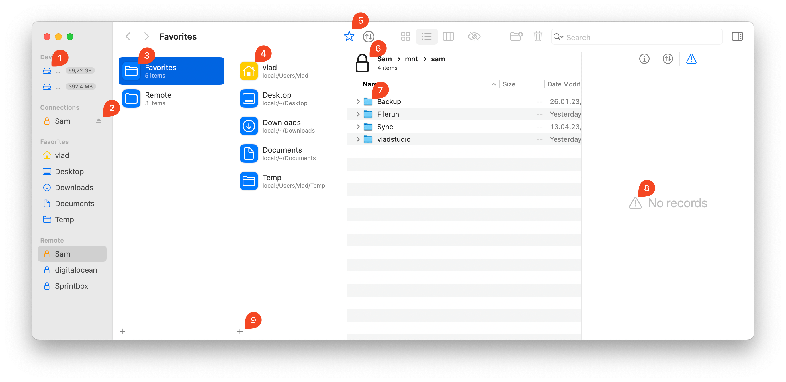
Favorites
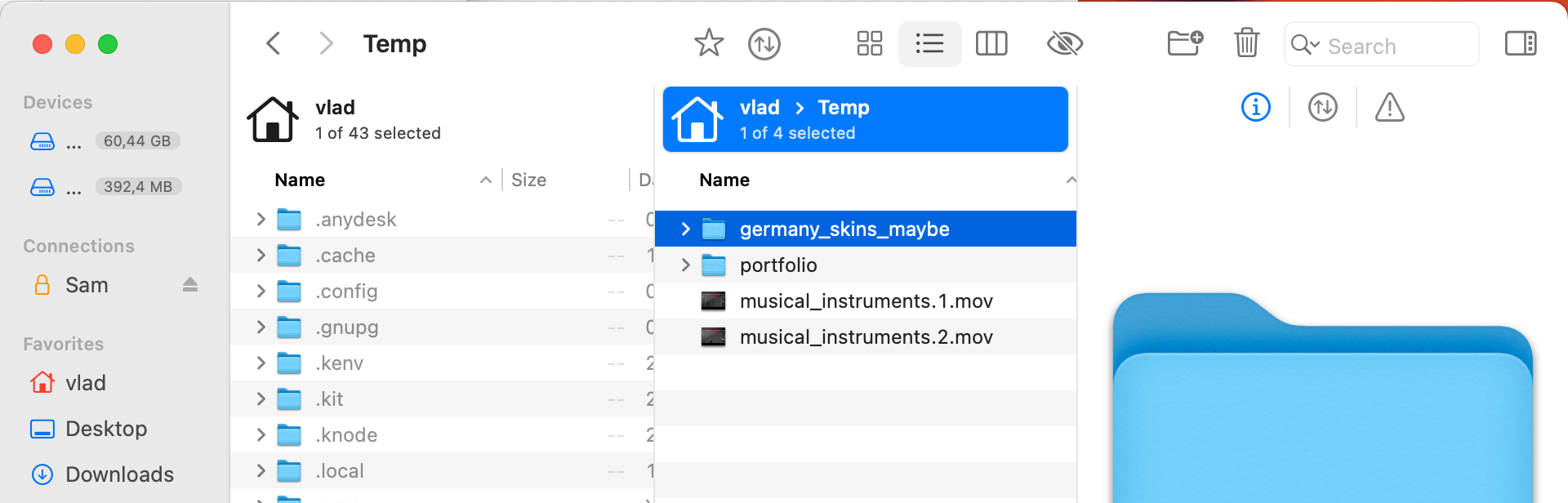
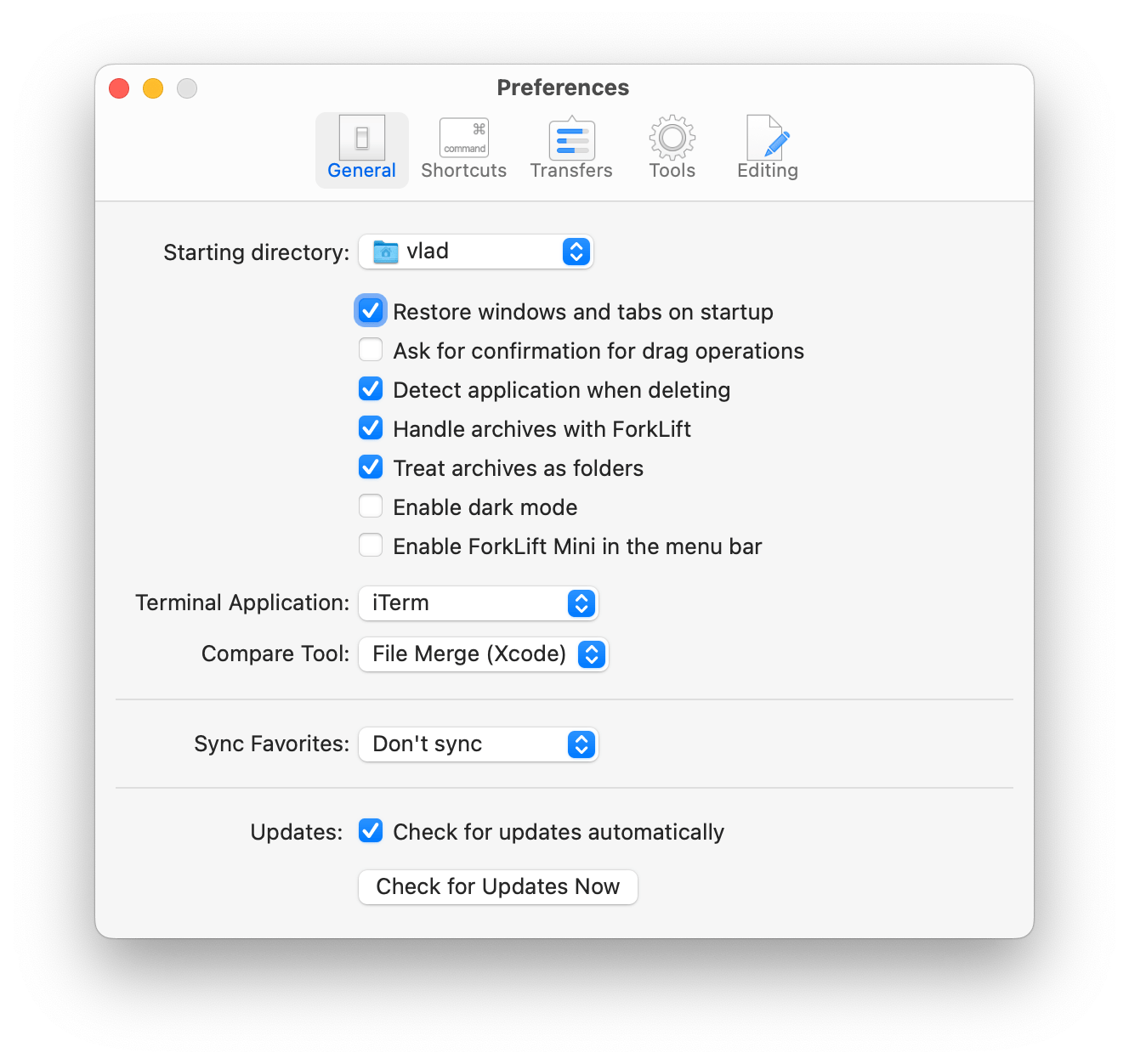
FL3:
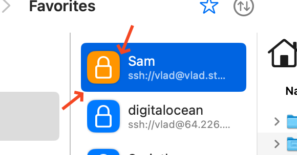
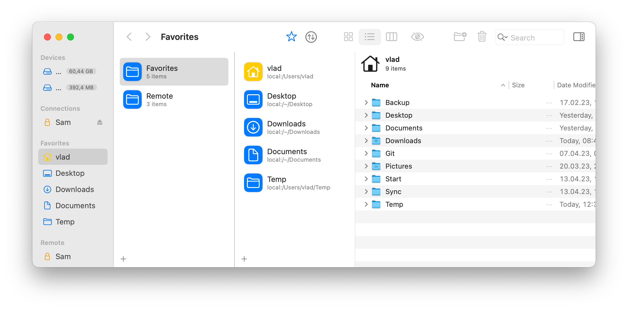
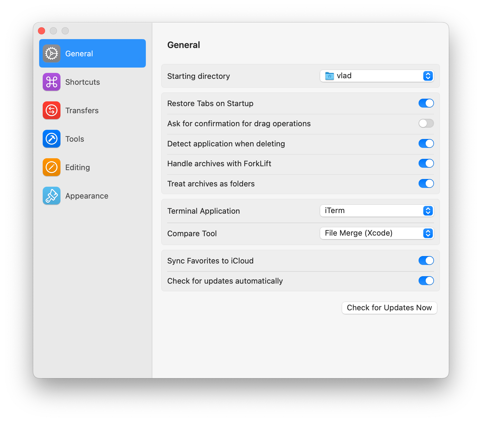
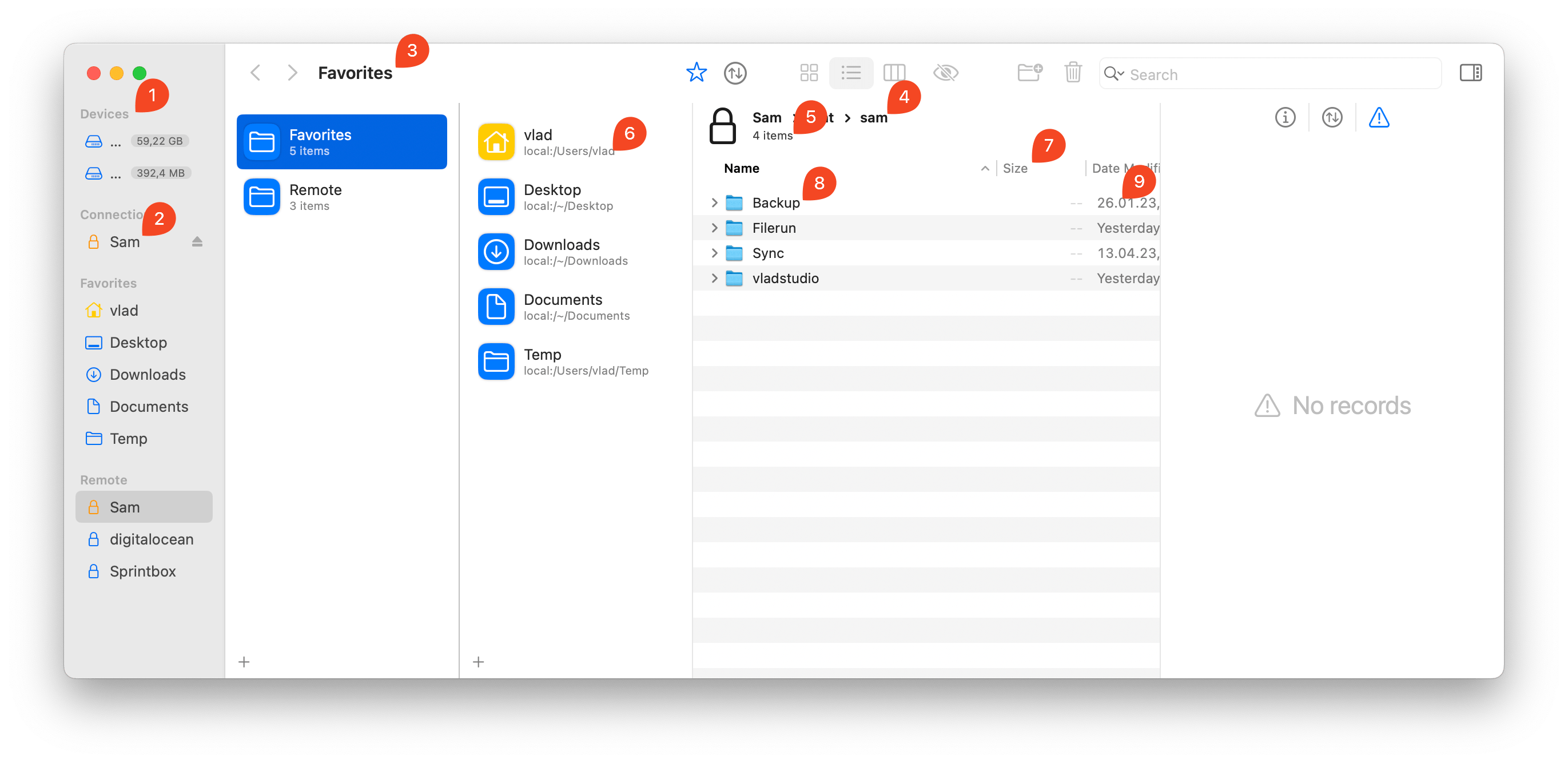
FL4:
The FL3 Favorites screen, in my opinion, not only looks cleaner but has better UX - I only need 1 click to access any favorite.
Despite not using any unique design elements, FL4 Favorites screen looks alien - the combination of sizes, margins, color choices is just something not seen anywhere else in the OS:
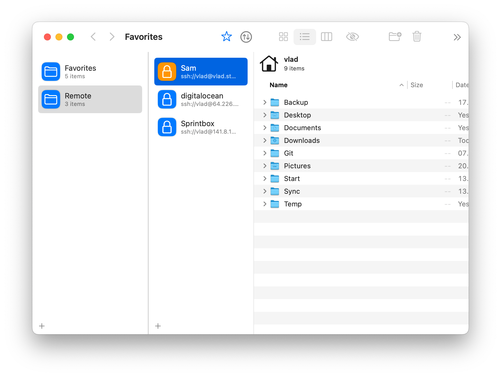
There are little details here and there that result in innacurate, inconsistent look:
👉 these dividers have different color
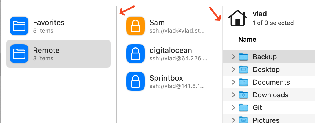
👉 these icons look like taken from two different icon sets, not really working well together
👉 these radii (radiuses?) do not match
Active panel bar
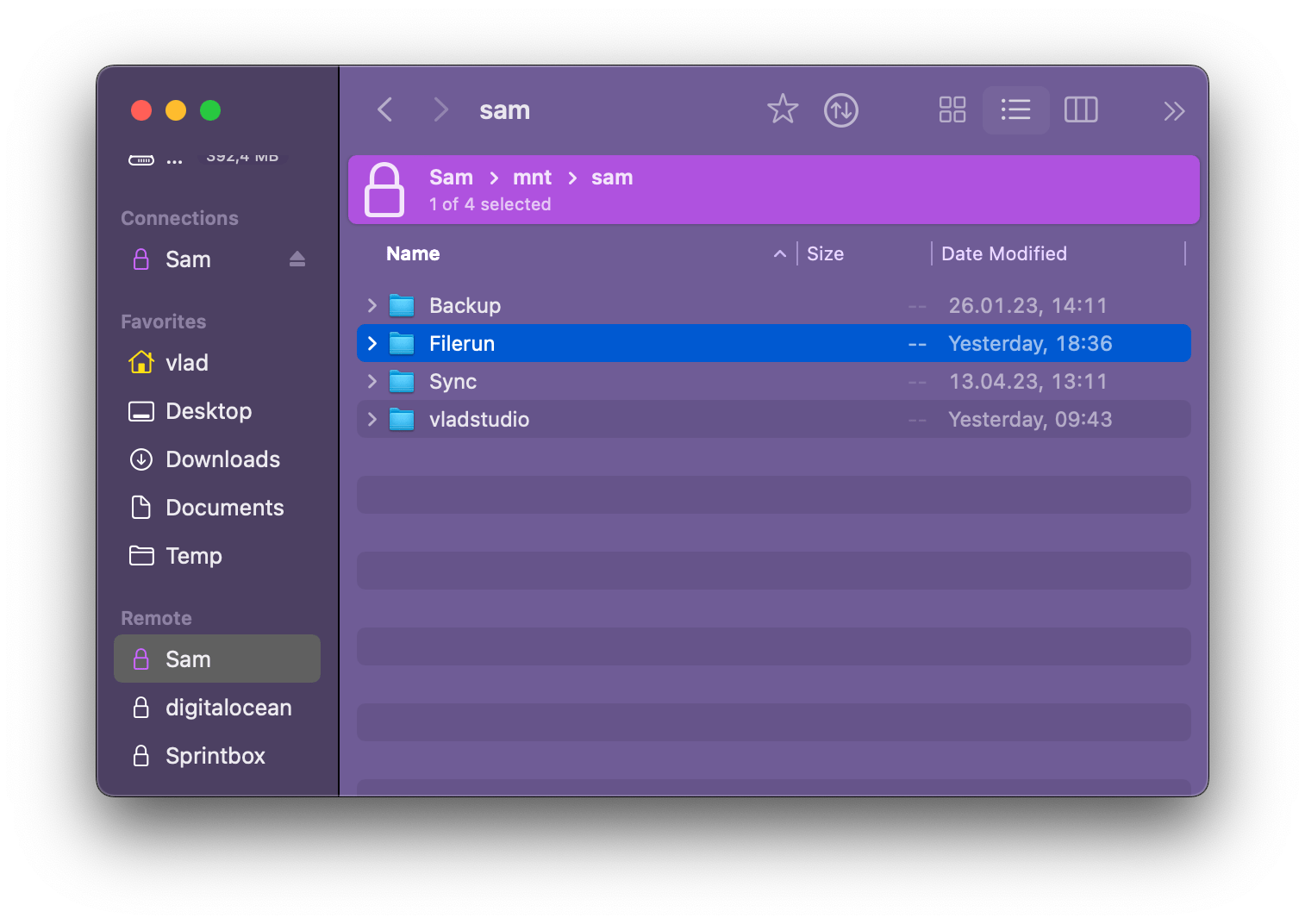
This is actually the single biggest reason I will probably stay with FL3. The active panel bar in FL4 is just too intense:
Btw there is no such bar in Favorites, which breaks consistensy and leaves me unsure what’s active:
Indicating active panel in multi-panel apps is a tricky design task, actually! For example, most VSCode themes use an active tab background color to show what panel is active. Looks good! Noticeable but not too intense:
(here the second panel is active, and its active tab is colored)
Arc uses a border:
Settings
Again, I assume your intention was to bring UI up to date with latest trends – most notably, latest MacOS system settings:
I must note their design is controversial:
https://eclecticlight.co/2022/09/20/system-settings-in-ventura-a-turn-for-the-worse/
https://www.youtube.com/watch?v=bU118F-qsXE
https://www.makeuseof.com/reasons-macos-ventura-system-settings-is-a-downgrade/
FL3 settings:
FL4 settings:
The biggest issue I have with FL4 settings window is the large icons. I realize that with only 7 items in sidebar, small icons would mean most of sidebar is empty – but if you increase icon size, suddenly the consistensy is broken and the sidebar does not look native any more.
(7 different colors is another problem.)
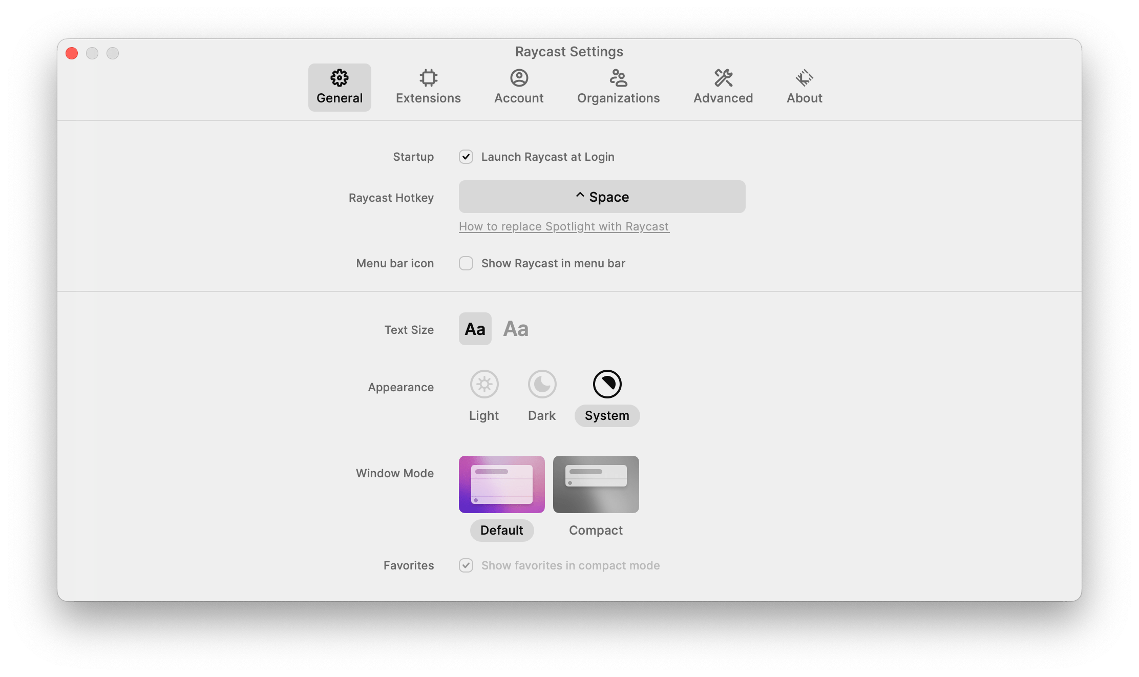
Dare I say FL3 settings were not broken, and new design brought no real improvements. Also, there are plenty of modern apps that do not follow this trend and their settings still look awesome. Raycast:
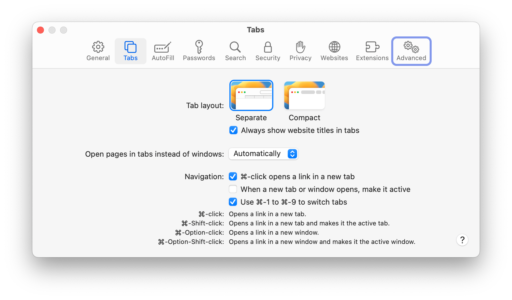
Arc:
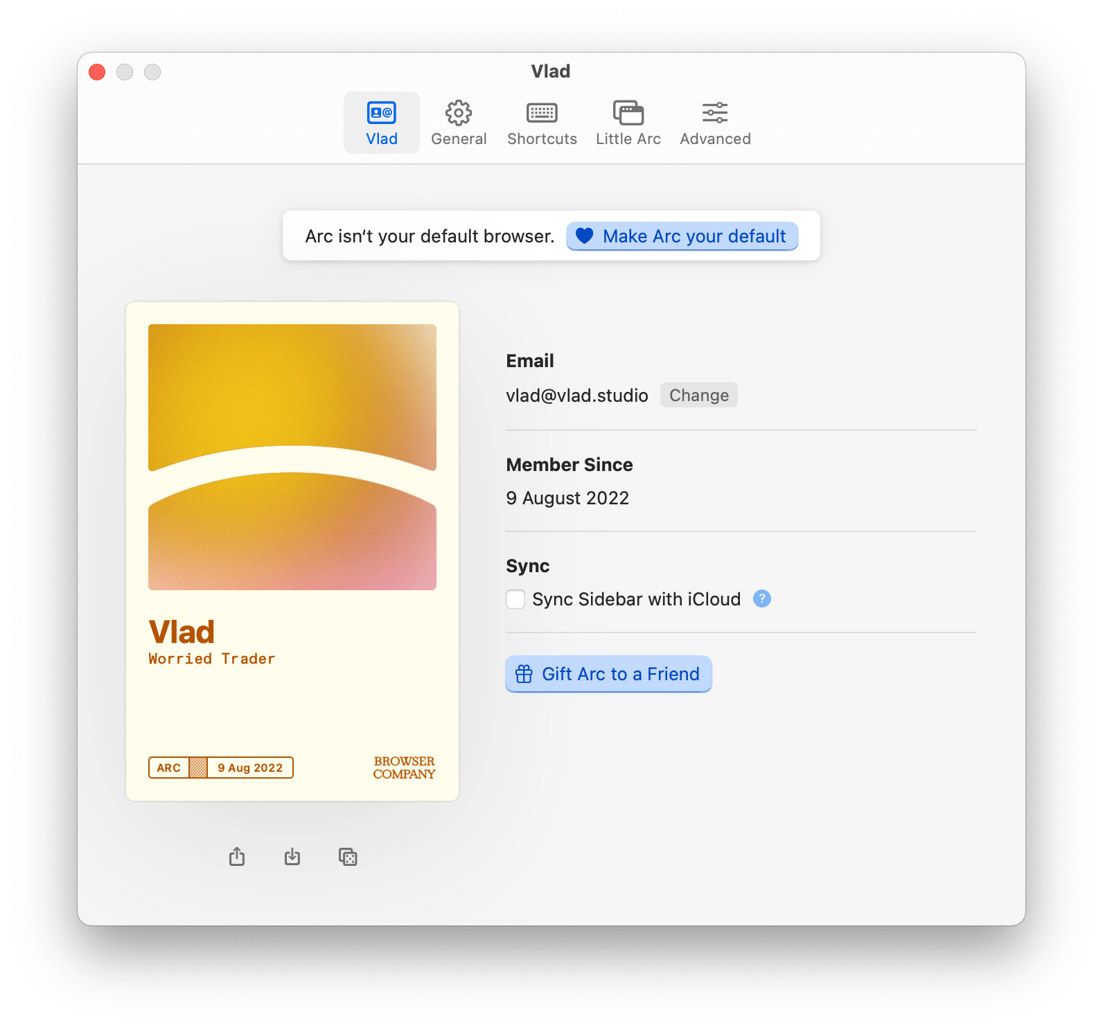
Tim.app:
Safari:
Shottr:
Sizing and spacing
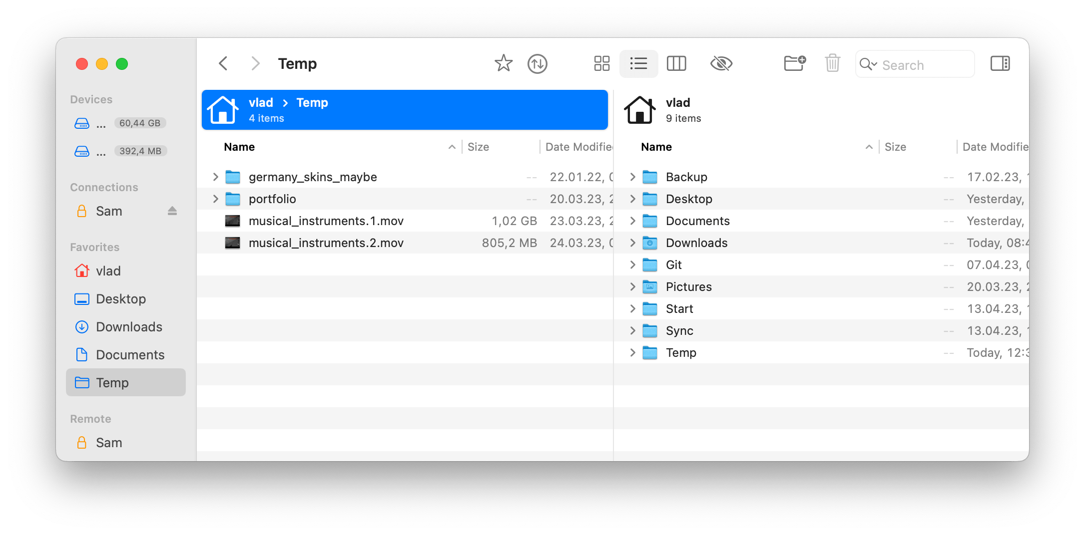
After studying the interface for some time, I think all the tiny unpolished details can be summorized as inconsistent sizings and spacings. For example, count the number of different icon sizes and styles here:
The large black lock icon stands out especially.
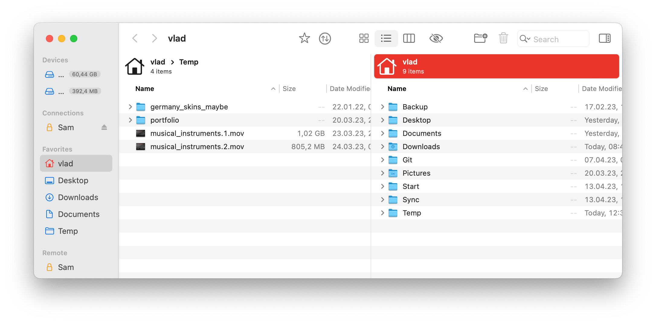
Same with font size and color:
I am not sure to what extent SwiftUI is to blame – I heard it’s quite buggy when it comes to polishing a consistent interface.
Themes
Themes are an awesome feature!.. In theory. In practice it usually means almost guaranteed maintenance nightmare - now all color choices need to be tested against every theme. And if you allow users to configure colors, or use OS-defined colors, this inevitably leads to strange color combinations:
I also noticed that if I select any theme (except Default), Forklift no longer responds to OS dark/light appearance change.
I think the best way to handle this is to
- have an
Appearanceselector withLight,Dark,Follow systemoptions; - and then have 2 separate lists of themes (light and dark).
See VSCode settings:
P.S.
I do hope you take my notes constructively. Finding problems is easy - finding solutions is not!
I am sure FL4 UI will improve over time.
Also, I wanted to experiment in an unexpected direction. What if Forklift 4 would be a “unique” app, not “OS-like”? What could it look like?
Here’s something I came up with:
Screenshots:
These are really quick drafts, purely for your inspiration.
Thanks for reading!